Showing posts with label complementary colors. Show all posts

Wednesday, January 23, 2019

Color Vision 5


Color Exercises

Let's take a brief break from the tips and techniques of the Color Vision series to do some color exercises you might like to try as a way to exercise your visual muscle. My suggestion is to first look for scenes or past images that fulfill these exercises, and of course use them to compose when you photograph now to see how they work.

 This hand tinted fall scene, adding pastels to embolden the print, was made along the Chama River in New Mexico and shows how color offsets, here the warm colors of the foliage set against the distant mountain and sky, create a feeling of distance and space within the frame.

*Look for complementary colors to offset dominant colors (those that take up most of the scene) or subjects with those colors.

*When shooting in color cast conditions (sunrise/sunset, fog, snow etc) look for offset and accent colors, such as warmer colors with an overcast sky or cooler colors when the sky turns warmer late in the afternoon.

*When working in color "families", look for complementary colors as accents.

While this scene would be characterized as "cool" in overall color cast, the red accent on the life preserver holder on the pole is a complementary color accent that catches the eye. 

*Create a color “shimmer” with equally valued complementary colors.

*Use exposure techniques to change color intensity--overexpose for paler colors; underexpose slightly for increased saturation. When shooting monochrome color scenes, vary exposure plus and minus by1 stop to explore color contrast effects.

*In a distant landscape, cool colors say "distance". Create scale and perspective with complementary colors in the foreground.

*If a foreground subject has a dark color, and the background is dark, seek complementary colors to increase contrast. The same holds true for a light foreground and background.

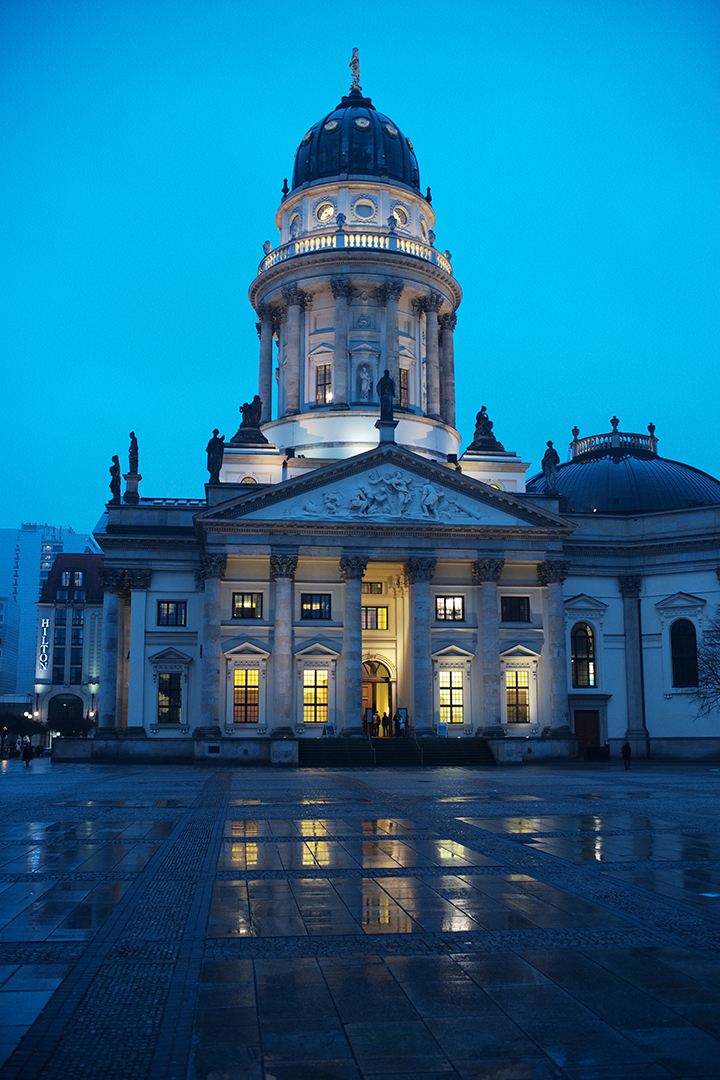
Photographed right after sundown under an overcast sky, a blue color cast dominates, but is offset by the complementary yellow of the building lights. Note how the lighter hue of blue in the building details offsets against the darker sky.

*A bright color will always dominate a more muted color. Use of complementary relationships will increase the visual energy of the background.

*Explore monochrome effects in different hues.

*In a scene with a family of colors, compose so that one hue dominates the frame, allowing the other hues to play supporting roles. 

Next in the series: How the eye and the camera "see" differently: color recording, color temperature and more.


Friday, January 11, 2019

Color Vision 4


-->
 Color Relationships

Color relationships within a scene create feelings of harmony or discord, of calm or excitement to the eye. Certain color relationships form the basis for color play that has proven fruitful for artists through the centuries.

There are special sets of colors that seem to form a unique bond. Look at the work of painters such as Cezanne, Monet or Seurat, and the photography of Pete Turner or Ernst Haas, and you will discover how color relationships play a special role in both enhancing content and drawing the eye into the scene.

The setting sun striking these bushes on a stream bank  creates an offset against the shaded blue of the rocks and stream behind them, reinforcing and heightening each color and area within the frame. 

One set of relationships are complementary colors, such as red/green, orange/blue, and yellow/violet, opposites on the color wheel. When both colors are present, and in close proximity, they intensify one another. For example, a red or yellow flower will always stand out more against a field of green. The degree of richness and brightness of these opposites also has an effect on the power of the visual response.

The "complementary effect" may explain why we are so dazzled by sunsets. When orange/red clouds intermix with blue we tend to pause to consider the display. Mixed colors in the sky are always more fascinating than a continuous-tone blue.

When colors come from the same general band of the spectrum they are said to be of the same "family". They harmonize with one another, and have an effect on the scene’s mood. We tend to describe these families as "warm" (red, yellow, orange) or "cool" (blue, violet, green.)

The unity and harmony of this bucolic scene is created by the dominance of the warm color cast by the rising sun. 

People have different reactions to certain color relationships. Some tend to find cooler color scheme restful; others find them “cold” and less inviting. Some say that warmer plays are more intense, while others find them peaceful. A "cool" image may be made of a forest floor under a canopy of trees; a "hot" color scheme might be the range of colors in a desert sandstone formation.

Images can benefit from a hint of complementary or even anomalous color thrown in: these "hints" of complements are like strong accents that can attract the eye. Having a dash of "cool" colors in an overall "warm" color scheme can be very effective, and vice versa. Playing with color families and then spicing it with complements can heighten the vividness of any scene.

While the overall effect here is of a "cool" scene (blue dominated), the small branches and red leaf create an accent that catches the eye.

Another fascinating color effect is provided by monochrome (not black and white but color play within the same hue). When we seek monochrome color compositions we are exploring a relatively narrow band of color, with slight variations in saturation and brightness. This differs from black and white photography, where we are dealing with shades of gray, but is analogous to black and white in that texture and tonality can be explored.

This canyon wall is dominated by warm colors within a fairly narrow range of the spectrum, but the lights and darks and streaks of white create a textural visual play. 

The color schemes and plays you choose for your photographs comes down to your taste and subjective reaction to a scene, and there is no right and wrong in what you choose to do. But study of color relationships will open your eyes to more possibilities, and taking chances with color can lead to some exciting results.

Next post: Some color vision exercises