An exciting aspect of digital inkjet printing is the wide range of paper surfaces available, an important element of the print’s expression. Now, a new concept in paper composition, surface and “look” has become available—Hahnemuehle’s Bamboo 290gsm, part of the company’s “Natural” lineup.

Photo: Courtesy Hahnemuehle: The Hahnemuehle Natural Lineup includes Bamboo, the subject of this review, and Agave and Hemp made papers. The other papers in the lineup will be reviewed in a future posting.
There are two aspects to the Natural line that make them intriguing: one is the sustainable manufacturing process. All the materials that supply the cellulose in these papers are made from raw materials that require minimal maintenance, grow quickly and do not need any pesticides. The other is their unique look and feel. This review covers Hahnemuehle’s Bamboo paper, dubbed by the company to be ideal for “spiritual” black and white and color images. In addition, the paper is made with no OBAs (optical brightening agents) and has “certified archivability”—their phrase, not mine.
Paper Surface and Rendition
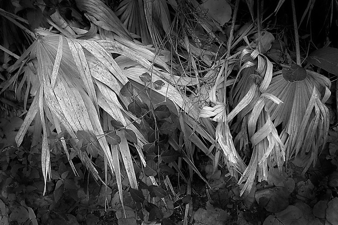
Bamboo is a natural white, warm tone paper with a lightly textured, almost buff surface that I found to be an interesting choice for warm tone and certain other monochrome images. The paper is somewhat warm, but not brown/yellow, although when a blank sheet is held next to a bright white paper the differences become apparent. In my tests it also performed well with color, albeit those that lend themselves to a low-saturation rendition. In terms of monochrome, it gave me impressive results from a series of images made with an IR (infrared) altered digital camera, probably the most expressive prints from those images I have ever made. Perhaps as important, it engenders a search for other images that would benefit from its unique look and feel.

My first instinct for testing was a group of images made with an IR-converted DSLR. This photo was made in The Everglades, and the paper match was just right and resulted in the most expressive prints I have ever made from this set. Copyright George Schaub.
Test Procedure
I did my tests using a Canon Pro-1000 printer and processed via Photoshop. I first downloaded the ICC profile from the Hanhnemuehle web site (www.hahnemuehle.com) and added it to my Color Sync profiles on my Mac. I printed using the dedicated profile in Photoshop managed color as well as printer managed (with black and white checked in the dialog box for monochromes), choosing heavy weight matte as the media. Both worked with matte black ink. The fairly heavy weight (290 gsm) requires a single sheet rear loading procedure with this Canon and other similar level desktop printers.
This is a single-sided (coated) paper, so it’s important to determine the printable side, as the slight texture can make it difficult at first to tell front from back. You can feel the difference by running your fingertip along the surface to feel the grain, which is slight in this paper. I could also see a distinct difference in the surfaces when angling the paper back and forth under a strong light. The company literature advises, if need be, to get a sense of front from back by slightly wetting your finger to feel the more “resistant” grain, although I hesitated to do this, fearing I would harm the print surface, but if you do this be sure to do so along an edge.
The company also advises that you might get a slight coating loss onto the print transport after running numerous prints, and suggests that you run one or a few (uncoated) standard sheets through to clear the transport, which should handle any problems. (Note: I did not notice any problems in that regard after going through 25 sheets of 13x19” paper.)
Print Controls and Options
As mentioned, I ran some tests using both printer and Photoshop managed color, the former using “heavyweight Fine Art matte” and the latter using the downloaded profile. Side-by-side I noticed slight differences in the darker values, with the profiled print showing slightly more open values, but nothing dramatic. There was also a very slight difference in the print color, with the Photoshop-profiled one being somewhat more neutral in tone than the printer-profiled one, which was a tad warmer.
While tonal values on prints are not always literally translated to repro, the paper can produce a deep black, although it certainly does not have the snap found in glossy or Vellin surfaces. It's more like a "buff" black look, akin to charcoal or chalk pastel. Copyright: George Schaub
One control you might want to test is found in the small checkboxes under the preview in Photoshop, particularly “Match Print Color.” Click it on and off to see what best matches the image you have loaded. In some cases it can be quite noticeable, and assuming your setup is profiled it will give you a better visual idea of what will result. In some cases it can help with “un-muddying” darker values and resulted in a crisper, though not deep black, but again test this, as it seems to be image dependent.
Image Intent
This brings up matching image with idea and result with intent. This is a paper that renders values in a unique way, one that you could describe as “spiritual.” It’s not a matter of sharpness, but of mood. I would not choose this paper for color-rich or deep black value images, which I usually print to bring out the “snap.” That’s why my first instinct was working with those IR images, which have unique mid-range and especially highlight values. In that sense it is a paper designed for select, not general printing.

Bamboo is versatile enough to allow you to create a wide range of expression. This photo was made with a Lensbaby auxiliary lens and has a naturally soft "aura." I dropped the saturation to match the mood and came up with a look and feel that was quite different from any print I had ever made from this image. Copyright George Schaub
This became apparent when I switched from IR to landscapes with high contrast values, which I usually print on a Vellin or smooth rag surface. The blacks are there in the Bamboo stock, but have a feeling of buff rather than hard rendition. I printed some images deep with very slightly suppressed highlights, and found that every nuance came through in both highlights and mid-tones. In any case it’s a unique look, one that creates an entirely different impression than other papers.
(One tip is to give the print time to dry down before you make any quick adjustments. The print sets after an hour or so, although you probably should give it more time before you rush back to change the contrast or value settings, especially in dark tonal areas.)

One option perhaps worthy of exploration is making copy prints from old images. I copied this carte de visite from the nineteenth century and tried it out and got a nice rendition of values that, combined with the print surface, gave it a true look and feel.
Conclusion
Overall, I always welcome new papers to add to my creative gamut, and given the right image and processing, Hahnemuehle’s Bamboo 290 gsm will hold a special place in my paper stock cabinet when it comes to nature, landscape and even portraiture. While monochrome printers should certainly consider checking it out, those trying it with color images of a certain mood and style will also find new expressive avenues to explore.
1.
: Hemp is a bright white matt paper with a slight textural surface, ideal for color work; and Agave has a more textural surface with a bright white base. All the papers are 290gsm and none use optical brighteners.