Tuesday, April 21, 2020

Review--Hahnemuehle Hemp Fine Art Natural

This is the second paper review in the Natural Line, with the March 30, 2020 posting in this blog covering Bamboo. 

Hahnemuehle’s Natural Line is thus far composed of three papers: Bamboo, Hemp, and Agave, the latter two being the more recent additions. I refer readers to the above-mentioned posting for info on manufacturing and other aspects that make this group an interesting option for inkjet printmakers.

The neutral warm tone of Hahnemuehle's Hemp inkjet paper, part of the "Natural" trio of recently introed papers, brings to mind Agfa's Portriga (silver halide) paper, albeit with a textural surface. This print was made using Printer Managed Color in Photoshop on an Epson SureColor P-800. I printed using Epson's Advanced B&W mode--see other setup specs below. Copyright: George Schaub

Hemp, like its sister papers, is a medium/heavy weight paper (290 gsm) that requires single sheet feeding in desktop printers like the Epson SureColor P-800 and Canon imagePROGRAF 1000. Its substrate is composed of 60% hemp fiber and 40% cotton white. Paper cast, or tone, is slightly cooler than Bamboo: setting it between standard 20lb copy paper and Bamboo shows that while not bright white it is less warm than Bamboo, which makes for a somewhat different approach to print setup. There are no optical brightening agents added so the values portrayed after the dry down are those that should stick for quite a long time, given proper storage and display.

I tested a box of 13x19” Hemp using a Mac Mini and Epson SureColor P-800. I worked with both printer-managed color (using Epson’s Advanced B&W mode in the setups) and Photoshop managed with Hahnemuehle’s ICC profile, available at https://www.hahnemuehle.com/en/digital-fineart/fineart-media/natural-line/p/Prod.

Paper Handling
While distinguishing front and back on Bamboo was a bit problematic at first (quickly learned after a bit of practice) the surface on the Hemp paper is slightly more textured—not ruffled or watercolor textured but enough so that a quick rub of the finger will note the bite. The Epson requires a front feed for fine art stock like this, and transport was smooth without one mis-fed sheet or jam throughout the sessions, indicating a nice flat layout that did not need reverse curling like some heavier fine art stock.

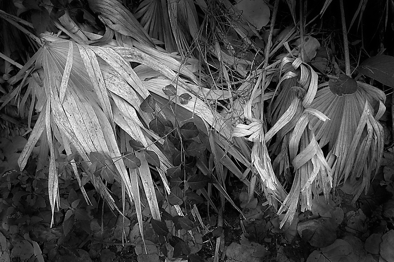
I chose a few nature scenes (including one from the set of Everglades IR shots tested with Bamboo) but as I worked I became more interested in architectural images, perhaps because of the more neutral tones. (This of course is a matter of personal taste.) Like any printmaking session, how you set up the printing parameters, and what you learn from the choices you make will greatly affect results and your satisfaction with what the paper can deliver. Here’s what worked for me and what I learned.

Printer-Managed Color
I have been a fan of Epson’s Advanced B&W mode for many years, especially with its upgrade a few years back, so I tried that first. In the Photoshop print dialog box I chose Printer Managed Color, then opened Print Settings and chose size (13x19), load (front fine art) and, because the Epson driver wants to hear about surface to manage ink distribution, a type of paper--from the surface of the Hemp stock I deduced Cold Press Natural.

Note: this is just a coincidence and does not mean the Hahnemuehle paper matches that surface exactly, but it was the best setting I found. You can try others and each will give you a somewhat different look, although straying into any Luster or Gloss or even Satin finish will not be a good choice as ink laydown for these are quite different than for matte stocks like Hemp. Also, this model Epson switches out black ink channels depending on paper surface choice, and you certainly do not want PK ink (gloss absorption) rather than MK (for matte surface papers) or waste ink supplies on switchovers.
Using Printer Managed Color with this model Epson allows access to Epson's Advanced B&W controls, which allows leeway in choosing warm to cold rendition. Of course, this is in addition to the "color" or tint of the paper itself, which here is slightly warm (though not as warm as Bamboo, in my tests). A slightly blue tone was added here resulting in a cool (not blue) biased overall tone. Copyright: George Schaub

As mentioned, I chose Printer Managed Color in the dialog box and in the print settings picked Cold Press Natural; Epson Advanced B&W, neutral tone; high speed and finest detail. Also, I suggest you open up the Levels Adjustment Layer and check that the histogram is tucked into the full gamut (in other words, highlight and shadow deltas hit the edge of the highlight and shadow values.) You can adjust the midtones as desired, but pinching in the outer deltas, in my way of printing, improved the darker tones and avoided muddiness without losing lower value separation. This will of course be image dependent, but do try these options to see how they affect results.
To bring out strong shadows and highlights you may have to work with the Levels or Curves Adjustment Layer and "fill the gamut", then modify with the midtone areas. Keep in mind that there is a drydown on this paper than can result in richer deep values, but getting close right out of the printer is best. Copyright: George Schaub


This is the type of image and result that made me think of the classic #2 Agfa Portriga silver paper developed in Dektol. Gray values are smooth and creamy, with rich though not opaque blacks, and even spectral highlights (reflections of the Spree on a government building in Berlin) are rendered with texture and separation. Copyright: George Schaub


Photoshop Managed Color
By far the easier route is Photoshop MC. You can still tweak as desired, but downloading and choosing the profile in your setup box avoids, in my tests, the histogram work and overall yielded the best tonal values and reproed the screen preview in my first proof. You will note a few checkboxes beneath the Preview window in the Photoshop print dialog box. The two of note here are Show Paper White and Match Print Colors. Toggle them on and off to see the difference. You may note a shift of contrast and especially rendition of shadow and black tones. Once done, this shows a very good proof of output, so print it out, then tweak via burning, dodging, and kicking up local contrast etc. to get to your final, which thus becomes a two print process. In other words, this workflow brought me to a work plateau that bypassed the basic fussiness and let me consider the corners and local values called for right after the first proof. 

Workflow is of course your call, but I suggest you do a few test sheets following both paths, Photoshop and printer Managed Color, and discover the differences for yourself, and see what suits you best. 


…And Color Prints Too?
I must admit that my first choice for this surface are monochromes, but did want to check out how it performed with color. Well, just fine for certain ones, although my first instinct is not to [print color on a warm-bias paper such as this. But when you are after a certain look and feel that would benefit from this warmth (nature scenic, florals, impressionistic landscapes—well, that’s quite a few areas) then it can serve as a very pleasant complement to the image itself. My tests were limited in this regard, but I did find that the Photoshop Managed Color (with ICC profile) was the truest proofing method, and frankly when time permits I will get into color printing with this paper by exploring my files for likely candidates.

While I first thought that Hemp would not be my first choice for color work, my tests showed me that there are certain images that gain a special look on this paper. This is a copy stand shot of a hand-colored (Marshall Photo Oils) silver print done many years back. First, the image "belongs" on a lightly textured surface, and second the warmth of the stock was a prefect match. More testing on late afternoon light nature shots is definitely in order for me. Copyright: George Schaub


 Conclusions and Recommendations
For those darkroom workers old enough to remember, Hahnemuehle Hemp is somewhat akin to Agfa Portriga developed in Dektol, albeit with a matte surface. Translation: a warm tone paper developed in a cold tone developer. In other words, while shadows and deeper values are “warmish” due to the tone of the substrate (and of course the ICC profile) they are certainly not overly so. (An advantage of using the Epson Advanced B&W mode are the numerous presets for various monochrome renditions, from cool to quite warm, options that await further exploration in my tests.) Depending on processing, of course, highlights are well rendered, even when they are spectral (that is, interference patterns like sun on water). With some practice you can reveal deep blacks and low value separation without going “muddy” or having to do gymnastics to maintain value separation. 

When I consider a paper to include in my stock I consider how it encourages me to explore my image files to find a good match or to simply find new expression for a previously printed shot. This is not what I’d call a general use paper, and my inclination is to use it mainly with monochrome images, but, as mentioned, it has intriguing possibilities for color I have yet to explore. It is for me, in many ways, a paper that holds promise to expand visual and creative options.


Saturday, April 11, 2020

The Interview Project--Rick Sammon

This article, by Grace Schaub, was based upon an interview with Rick Sammon published in the mid-nineties in Photographer's Forum magazine. Rick, a friend for many years, continues his writing and photography today and is still very active in teaching, leading workshops, and writing about technique and vision that continue to educate and inspire photographers worldwide.

At home both at his desk, penning articles and books, and in the field, where he has established a worldwide reputation as both a travel and underwater photographer, Rick Sammon's prolific output has made him one of the most respected and widely-published writer/photographers working today. Along with his work goes a commitment to the earth, one in which he uses his talents to promote an awareness of our fragile underwater environment. His work has taken him to exotic and exciting places both above and below the sea.

Rick's love of photography and writing began early. But like many photographers, he also had a passion for music. He attended the Berkeley College of Music in Boston, and aspired to be a jazz musician.  While some young musicians drive cabs or wait tables, Sammon decided to put his interest in photography to work, and he started doing freelance jobs and eventually submitting articles to photo magazines.

As he continued to write and get work published, he got to know the publisher of one of those magazines, Studio Photography, and when the editor's job became vacant he was offered the position. He took it, and for three years he ran the monthly journal for portrait and commercial photographers. From there he entered the world of public relations, handling the Minolta account during the introduction of their autofocus SLR cameras.

It was during that time that Sammon became involved with underwater photography and a growing consciousness about preserving the fragile underwater environment. While on assignment for the magazine in Texas he met Bernard MacFadden, president of CEDAM, an exploration organization whose acronym tells the tale--Conservation, Education, Diving, Archeology and Museums, all to do with the world under the sea. The organization sponsors seminars, dive trips and works in conjunction with many worldwide and regional organizations to foster both a broad and focused approach to preservation and conservation.

MacFadden and Sammon became friends, and in 1979 Sammon became editor of the CEDAM newsletter; in 1985 Sammon assumed the role of president of the organization. He soon found himself traveling around the world and becoming involved with the global village of divers and dive activities. For example, Sammon led an expedition to the lost city of Nueva Cadiz on the island of Margarita off Venezuela, where over 750 artifacts were discovered and turned over to the local museum. He also worked on the organization's Galapagos Project, a ten year marine study done in conjunction with the Charles Darwin Foundation. The Belize Project is done in cooperation with the New York Zoological Society and resulted in the establishment of marine parks. Cedam's Red Sea Project helped collect specimens for the New York Aquarium.

While these good works have resulted in many benefits for local museums and societies, they also helped contribute to Sammon's impressive collection of underwater photography. As most divers are also avid photographers, Sammon's work is highly appealing in that it combines the best of both worlds. One of the results of his years of shooting is a beautiful book entitled "Seven Underwater Wonders of the World", published by Thomasson-Grant.

The book, a must for avid scuba photographers and lovers of natural photography, is also a plea for Sammon's overriding concern--the calling of attention to the ecological problems confronting the deep-sea habitat. As he says, "We were looking for a project to protect the underwater world, but we needed a hook, something that people would connect with. That's when I got the idea for the `Seven Wonders.'"

The sites, including the Belize Barrier Reef, Lake Baikal in Siberia, the northern Red Sea and the Galapagos Archipelago, were chosen from among a checklist provided by an international selection committee of marine scientists and conservationists. The book contains 181 color plates and has become a classic among dive photographers, and also established Sammon among the top underwater photographers in the world. Aside from publishing the CEDAM International Reef Report, a newsletter about activities and concerns of the organization, Sammon has produced slide shows, videotapes and given frequent lectures on the subject. He also became a member of the Explorers Club.

Sammon's interest in nature and his experience with photography and publishing also resulted in numerous books and articles. With the birth of his son, Marco, two years ago, he focused in on the fact that one of the main reasons for his fight was to preserve the world for his son, and for his son's sons. He began looking at children’s books as a way to bring the wonders and appreciation of nature to future generations. With his wife Susan, who has been with him on literally every dive and shoot, he authored two books in conjunction with The Nature Company. Naturally, the first was entitled "Under the Sea", but the catch here was that all of Rick and Susan's pictures were printed in 3D, and the book included 3D glasses--just the technique to catch a kid's attention.

Today, Sammon continues to photograph, write and campaign for conservationist causes. He is a regular contributor to Outdoor Photographer magazine, and writes the weekly Associated Press syndicated column on photography. This year, he will be publishing five books, two with the Nature Company and three with Voyageur Press. He also continues to write freelance for a broad range of magazines and newspapers in the photographic, ecological and general-interest fields.

Through it all, Sammon remains one of the nicest people you'd ever meet. While his schedule and output would drive most people to distraction, he has seemed to learn how to maintain an even keel throughout. While his experiences around the world have given him a certain perspective, the birth of his son has put that perspective into an even sharper focus. If you have a chance to read one of his books, or can catch him when he lectures or gives workshops, you'll feel the same keen energy and caring coming through. 


Wednesday, April 1, 2020

Interview Project: Lucien Clergue, 1983


Lucien Clergue was born in Arles, a city in the France’s Provence region. The city was home and inspiration to Picasso, Gauguin and perhaps most notably, Van Gogh. It is a region rich in history and the arts, and as Clergue grew up the moods and people of the area became part of his sensibility and vision.
Although well known for his studies of the nude (he had four books published on that theme, including Nude Workshop, (Viking Press), Clergue was also an accomplished landscape, and street photographer. He had one-man shows all over the world and his work is in the permanent collections of many museums.
He was a well-known lecturer and participated in workshops throughout the United States and France, including the Ansel Adams Workshop, the Maine Photography Workshop, and the New School in New York. He founded the Annual Festival of Photography in Arles, and also produced a number of short films, including a 1971 retrospective of his close friend Pablo Picasso.
I felt fortunate to meet Clergue in New York in 1983, when I conducted this interview, and later in Arles in 1986, when he and his gracious wife introduced us to its many charms. He often came to the United States to photograph and teach, and when I spoke to him in New York he had just returned from leading a workshop in Death Valley. I found him to be a sensitive and generous artist who was unique in his awareness of the issues and themes that concern us all, then as now, both as members of a wider society and as artists.
GS: You seem to be very busy. I saw your book, The Nude Workshop. Is that a particular theme you’ve always pursued?
LC Yes. Have you seen the other parts of my work? I have three major themes: one is landscape, seascape, the ocean; the other is the bullfight and all that goes on around it; and the third is the nude, which makes kind of a triptych and is working quite well. I look to relay a correspondence between life and death, a dialogue. What makes me concerned right now is that many books on my nudes have been published, and people are forgetting that I do other things.
GS They want to put you in a box?
LC It's too bad, but what can I do?
GS Did you begin with the nudes?
LC No, I began with people, circus people, and then I followed up with gypsies, and the first good nudes came in 1956. So the themes I pursue started to show in my early years. Depending on the year, I was doing the nude more than landscape or other themes.
GS Is there any reason that one theme would be pursued more than another in a particular time frame?
LC It depended on the opportunity to find models, or if I was working on a project, like a book, that I had to finish. I'm now doing a book on my country, on Provence, and this is something special. It will be in color. When I’m in the United States, I try to take three or four days shooting for Death Valley and Point Lobos, which I find compelling.
GS Do your themes intermix? Can you see themes within themes?
LC Yes, even in the nude work you can see that there are similar sections, like the sea, the forest, the desert, the urban landscape, and the section on Venice. So that makes a theme within a major theme, which I think is interesting, because you get a good spectrum.
GS So within the theme of the nude, you find that you can express all the themes you’ve been working on.
LC: Oh yes.
GS When you were doing landscapes, were you mostly attracted to your native area in France?
LC Not really. I've been doing a lot at Point Lobos, both in black and white and color. Also, I’ve been working since 1978 in Mexico, in the Yucatan, but I never made anything from that because it’s part of an ambitious project, and I’m not really sure where this project is leading. I have a certain feeling for it, but I still don't know exactly what it is.
GS But you're aware of something brewing?
LC Yes. I have a feeling about something in relationship to natural and human landscape, the works of man. So to mix all this together with work shot in Point Lobos, the Yucatan, India, and wherever is quite complicated, because I have to go from one place to another.
GS Do you see a conflict between the landscape of man and that of nature?
LC Well, this is where I want to see what’s happening. I don’t know—I know there is a relationship, in fact, a conflict. But on the other side, there is something complementary going on. Like in the Yucatan, in Chichen Itza, where you have all the heads of the dead around. And when you see in the forms at Point Lobos the sex of the male and the female. It’s interesting to see how nature creates life and how man celebrates death. This is the type of relationship I would like to express. Also the fact that all that is to celebrate the sun is quite interesting, and perhaps I’ll make my own interpretation of it. As soon as I get the key, I will go faster, because I’ll know where I’m going. But now I don’t know where the door is. For instance, I did a lot of work on the sand, over many years, and I could never really understand my feelings about what I was doing. Point Lobos became the key.
GS What made it the key?
LC It’s logical, always. I was working on a simple basis, which was the sand, what is before, what is after. So, before the sand were the rocks—fine, but not a simple rock. In fact, you have the symbols of life in the rocks at Point Lobos, like the sex of a man, the sex of a woman. There is a kind of luxuriance of sexuality there. It is the idea of nature as very prolific, very dynamic, very alive; and when you photograph, you show the life. And the man appears upon the world (it’s about the middle of the book); you see the footprints of man. Some people, when they see that, see it as a kind of an aggression. “Oh, something wrong will happen here,” they feel, and man is there. And he’s bringing his car and he’s polluting the place, disturbing everything. And in the end he turns the earth into a cadaver; he brings the earth into plastic, and there is no more room for man. That duality between man and nature is quite interesting. And perhaps it’s political, because man has the atom bomb and wants to destroy the world. It’s a difficult road; you don’t know where you’re really going, because you always have two directions, and there is never a distinct indication of which one to follow. You have to make a choice, and hope it is the right one.
GS In the bullfight, you know the end of the story. Isn’t that a kind of “logic”? Do you know the end of your stories?
LC No. And even if I knew the end of the story, I’d try to reverse it, because then it would be like music. For instance, Bach used to change his mind; when you were expecting one note to finish a partition, he’d give you another one. And I think this is interesting; you know, you’re not obliged to do what is expected of you.
GS I’ve talked with other photographers who are involved with music, and they also relayed a feeling about the link between music and photography.
LC Oh, yes. Who?
GS A fellow named Walter Chappell.
LC Where is he now?
GS New Mexico
LC Give him my love and regards, and say that I would like to see him, to print with him. I met him years ago when he was in New York. So the music is part of our life. I’ve been studying the violin since I was eighteen, and when I started in photography, I had the feeling of music behind me. For instance, the languid nature of grasses, marshes; I had the feeling of organization, like in composition. The relationship you have with music is in the partition; in photography, that partition is the negative. And you have the interpretation, which is the positive. If you learn to read a negative as you read music, and learn how to print as you play music, then you realize how close the two forms are.
GS A piece can be played many different ways.
LC Indeed. When you play violin, you have many different positions of the arm. It will be the same note, but will give many different impressions if you play the first, the third, or the fifth position. This is where you need to have a good background and technique, to use this foundation to promote your expressiveness.
GS Different composers will interpret a piece differently. Do you oversee the printing of your pictures?
LC Up until now I did all my printing in black and white myself. For color, I use two different labs, and like to use mostly Cibachrome. I sometimes have prints done with the Fresson process, but I’m not entirely happy with it.
GS What brought you to photography?
LC In the beginning, I enjoyed the work of a photographer who was dealing with the bullfight, and I wanted to do the same type of work he was doing. I had no camera at the time, but I had a neighbor whose hobby was collecting secondhand cameras, and he would give them to me to test before he bought them. I started like that and never stopped.
GS So you wanted to capture something you saw in another photographer’s work?
LC I didn't know exactly where I was going. I knew I didn’t want to do commercial work or publicity. I worked a bit for a local paper, to support myself; I was working in a factory at the time, I tried to do some studio work, but it came out too artificial, too organized. I did some theatre work, and liked that. I kept shooting the bullfight, and all that went with that.
GS In the themes you work with, do you feel there are limitations imposed by photography itself?
LC Sometimes I see technical barriers. With the nude work, there is something of a censorship problem. You can’t do the work because other people are there, or there is a prohibition against it...it can be frustrating. And then there’s another aspect—in Point Lobos, for instance. There you’re not only dealing with nature, but with the fact that many other photographers have been there. You know there are certain shots you can’t do because they’ve been done; this shot is the property of Weston, and so on. I used to stay with Ansel Adams out there, and sometimes I’d come back from a shot and say, “Ansel, I’m really frustrated because I can't understand the messages of God today,” and it was true. I would be there, and I wouldn’t be ready to understand what was happening. This is where we are alone and can’t be supported by anybody.
GS There is reinforcement, though, and that's what keeps it going. Even with the frustration, the moments of connection do occur.
LC Well, it’s part of the game. You have to accept that there is a limit somewhere and sometimes you are not ready for what’s going on.
GS Do you remember any pictures that became particularly important for you—that moved you into another exploration?
LC Since 1959 I’ve been dealing with a pond. I was so happy with it that I came back to it each year during a ten-year period to refresh myself, like touching the black stone. And I think this is good.
GS So there is a connection, a moment within the process of shooting that caused this excitement?
LC Yes, and this sometimes irritates people, because you cannot share this instant. It’s very nice when it’s happening. It’s not a frequent occurrence, but sometimes you immediately have this fabulous feeling, because you are receptive to it all.
GS Is there any way that you gear yourself for receptivity, or is it something that is part of your life now?
LC On one side, we know a lot so we can go much faster; on the other side, we go slowly because we see what we have missed. It’s a strange situation. What you think when you are twenty, when you are thirty, forty, fifty is so different. I am almost in my fifties, and I look back and say, "Oh, I was able to do all this in that amount of time,” but no, I still work. I have to follow what is new and go ahead. I like to provoke myself, to take risks, because that is the way I prosper and get encouragement.
GS So the provocation, is that a form of inspiration for you
LC I like the words of Cocteau, when he says, "Be ready to catch the invisible, who made the terrible mistake to show up.” To do this, you have to have inspiration, but you have to be careful of it also. Stravinsky said, “Inspiration is like babies, you have to put them on the pot every morning.” You don’t just sit down and wait for inspiration to come; it's work, every day, every day. It’s all part of the game.


Monday, March 30, 2020

Review--Hahnemuehle Bamboo Fine Art Inkjet Paper 290 gsm

An exciting aspect of digital inkjet printing is the wide range of paper surfaces available, an important element of the print’s expression. Now, a new concept in paper composition, surface and “look” has become available—Hahnemuehle’s Bamboo 290gsm, part of the company’s “Natural” lineup.
Photo: Courtesy Hahnemuehle: The Hahnemuehle Natural Lineup includes Bamboo, the subject of this review, and Agave and Hemp made papers. The other papers in the lineup will be reviewed in a future posting.

There are two aspects to the Natural line that make them intriguing: one is the sustainable manufacturing process. All the materials that supply the cellulose in these papers are made from raw materials that require minimal maintenance, grow quickly and do not need any pesticides. The other is their unique look and feel. This review covers Hahnemuehle’s Bamboo paper, dubbed by the company to be ideal for “spiritual” black and white and color images. In addition, the paper is made with no OBAs (optical brightening agents) and has “certified archivability”—their phrase, not mine.

Paper Surface and Rendition
Bamboo is a natural white, warm tone paper with a lightly textured, almost buff surface that I found to be an interesting choice for warm tone and certain other monochrome images. The paper is somewhat warm, but not brown/yellow, although when a blank sheet is held next to a bright white paper the differences become apparent.  In my tests it also performed well with color, albeit those that lend themselves to a low-saturation rendition. In terms of monochrome, it gave me impressive results from a series of images made with an IR (infrared) altered digital camera, probably the most expressive prints from those images I have ever made. Perhaps as important, it engenders a search for other images that would benefit from its unique look and feel.
My first instinct for testing was a group of images made with an IR-converted DSLR. This photo was made in The Everglades, and the paper match was just right and resulted in the most expressive prints I have ever made from this set. Copyright George Schaub.

Test Procedure
I did my tests using a Canon Pro-1000 printer and processed via Photoshop. I first downloaded the ICC profile from the Hanhnemuehle web site (www.hahnemuehle.com) and added it to my Color Sync profiles on my Mac. I printed using the dedicated profile in Photoshop managed color as well as printer managed (with black and white checked in the dialog box for monochromes), choosing heavy weight matte as the media. Both worked with matte black ink. The fairly heavy weight (290 gsm) requires a single sheet rear loading procedure with this Canon and other similar level desktop printers.

This is a single-sided (coated) paper, so it’s important to determine the printable side, as the slight texture can make it difficult at first to tell front from back. You can feel the difference by running your fingertip along the surface to feel the grain, which is slight in this paper. I could also see a distinct difference in the surfaces when angling the paper back and forth under a strong light. The company literature advises, if need be, to get a sense of front from back by slightly wetting your finger to feel the more “resistant” grain, although I hesitated to do this, fearing I would harm the print surface, but if you do this be sure to do so along an edge.

The company also advises that you might get a slight coating loss onto the print transport after running numerous prints, and suggests that you run one or a few (uncoated) standard sheets through to clear the transport, which should handle any problems. (Note: I did not notice any problems in that regard after going through 25 sheets of 13x19” paper.)

Print Controls and Options
As mentioned, I ran some tests using both printer and Photoshop managed color, the former using “heavyweight Fine Art matte” and the latter using the downloaded profile. Side-by-side I noticed slight differences in the darker values, with the profiled print showing slightly more open values, but nothing dramatic. There was also a very slight difference in the print color, with the Photoshop-profiled one being somewhat more neutral in tone than the printer-profiled one, which was a tad warmer.


While tonal values on prints are not always literally translated to repro, the paper can produce a deep black, although it certainly does not have the snap found in glossy or Vellin surfaces. It's more like a "buff" black look, akin to charcoal or chalk pastel. Copyright:  George Schaub

One control you might want to test is found in the small checkboxes under the preview in Photoshop, particularly “Match Print Color.” Click it on and off to see what best matches the image you have loaded. In some cases it can be quite noticeable, and assuming your setup is profiled it will give you a better visual idea of what will result. In some cases it can help with “un-muddying” darker values and resulted in a crisper, though not deep black, but again test this, as it seems to be image dependent.

Image Intent
This brings up matching image with idea and result with intent. This is a paper that renders values in a unique way, one that you could describe as “spiritual.” It’s not a matter of sharpness, but of mood. I would not choose this paper for color-rich or deep black value images, which I usually print to bring out the “snap.” That’s why my first instinct was working with those IR images, which have unique mid-range and especially highlight values. In that sense it is a paper designed for select, not general printing.


Bamboo is versatile enough to allow you to create a wide range of expression. This photo was made with a Lensbaby auxiliary lens and has a naturally soft "aura." I dropped the saturation to match the mood and came up with a look and feel that was quite different from any print I had ever made from this image. Copyright George Schaub

This became apparent when I switched from IR to landscapes with high contrast values, which I usually print on a Vellin or smooth rag surface. The blacks are there in the Bamboo stock, but have a feeling of buff rather than hard rendition. I printed some images deep with very slightly suppressed highlights, and found that every nuance came through in both highlights and mid-tones. In any case it’s a unique look, one that creates an entirely different impression than other papers.

(One tip is to give the print time to dry down before you make any quick adjustments. The print sets after an hour or so, although you probably should give it more time before you rush back to change the contrast or value settings, especially in dark tonal areas.)

One option perhaps worthy of exploration is making copy prints from old images. I copied this carte de visite from the nineteenth century and tried it out and got a nice rendition of values that, combined with the print surface, gave it a true look and feel.

Conclusion
Overall, I always welcome new papers to add to my creative gamut, and given the right image and processing, Hahnemuehle’s Bamboo 290 gsm will hold a special place in my paper stock cabinet when it comes to nature, landscape and even portraiture. While monochrome printers should certainly consider checking it out, those trying it with color images of a certain mood and style will also find new expressive avenues to explore.


1.      


: Hemp is a bright white matt paper with a slight textural surface, ideal for color work; and Agave has a more textural surface with a bright white base. All the papers are 290gsm and none use optical brighteners.