It is a “smooth gloss” paper, which means that it has the
look and sharpness of traditional glossy paper while lacking the distracting
sheen of a “hard” surface gloss. For those who have worked in a darkroom that’s
like double-weight glossy dried matte. It has a weight and durability that
while defending the sheet from handling problems does not prevent the user from
using virtually every photo inkjet printer (not all-in-ones) out today.
I tested Baryta Prestige using a Canon PRO-1000 and Epson
SureColor P800, thermal and piezoelectric inkjet printers respectively. I
worked with three images: one with bold color, one a mixture of monochrome and
color areas, and one “straight” black and white.
Test Results
Both printers handle up to 300gsm weight papers through the
normal single-sheet feed paths, but being heavier weight I loaded the paper
using the Epson front-feed and Canon back/manual feed trays. While I would
advise flexing the paper to help it maintain flatness with the Epson, the Canon
manual tray path passed the paper through with no problem. (There was no
problem with the Epson either; it just seemed to be less than flat when feeding
it so I flexed it prior to aligning it with the guides and it passed through
with no skewing whatsoever.)
I processed the images in Adobe Photoshop CC 2015.5 on a
MacBook Pro that is calibrated to my Cinema Display. I downloaded the Canson
ICC profiles (www.canson-infinity.com/en/icc-profiles)
and worked with Photoshop Managed Color/Perceptual Intent on two color images
and black and white modes (printer controlled color in the Epson and the Canon black
and white print checkoff in the driver). I made no adjustments to the processed
image between printers. The paper
profile and surface called for PK (Photo Black) ink. If you have matte black
set up in the Epson you have to wait a bit while it switches to Photo Black;
the Canon uses two separate feeds for PK and PM inks so no swapping time is
required.
Overall both printers delivered very good results. Colors
were rich and true and highlight texture is nuanced. The paper surface has a
very slight stipple (unlike a hard gloss) and there is no noticeable gloss
differential. The weight of the paper is such that mounting and matting will
present no problems; overall it has a substantial and durable feel.
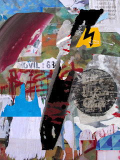
Canson ICC profile, Photoshop CC 2015.5, Madrid Wall Composite copyright George Schaub
In the color image, the Canon delivered a cleaner (somewhat
brighter) yellow and a slightly more differentiated red. Both printers yielded a rich D-Max (deep
black) with nice tonal gradation from dark to light gray. Bright whites were
clean with very subtle highlight values down from bright to soft white. Blues and
cyans seem richer on the Epson print. These comparatives are based on
side-by-side prints: taken alone each is very good and would be more than
pleasing to the eye.
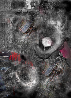
Canson ICC profile, Photoshop CC 2015.5, Composite 2 copyright George Schaub
I chose a composite graphic with both grayscale and subtle
color touches to check how the Canon and Epson would handle the black and white
values without using the monochrome checkoff option in their drivers. The dark
tonal areas of the monochrome values in the image were reproduced with a rich
and even startling depth; highlights maintained their starkness without loss of
textural nuance. If anything, the SureColor P800 yielded richer reds and
subtler blues, a result that was apparent in the full color image print as well.
I chose a monochrome image that displays a very wide gamut
of values, from creamy and textural whites through a range of grays to deep
black. I used the “black and white” checkoff in the Canon driver and Epson’s
Advanced Black and White mode. Both prints showed a depth and tonal separation
that was very pleasing, with the Epson printing out a tad darker overall. I
would not hesitate to use this paper for any of my monochrome images.
Conclusions and Recommendations
Now that we have printers that can yield excellent results,
printmakers owe it to themselves to work with inkjet papers that can bring out
the most vivid and vital tonal values and hues of the image itself. Working
with the ICC profiles and, with monochrome images and settings in the respective
printer drivers, Canson’s Baryta Prestige showed itself to be an excellent
partner to these two quality inkjet printers. New to the market as of fall,
2016, it can take its place among the thoroughbred class of fine art papers
that has the weight, surface, optical density, wide color gamut and archival
characteristics that will allow you to make prints that you will be proud to
display.
Contact, size and pricing: www.canson-infinity.com/en


No comments:
Post a Comment