Monday, January 23, 2017

Fotofusion Class Worksheet: B&W Image Processing with Adobe Lightroom CC

Notes and cheat sheet for the "B&W Image Processing with Adobe Lightroom CC" at fotofusion 2017, Wednesday Jan 25.


Adobe Lightroom CC Black and White Quick Tips

Lightroom is a browser and processor in one. While it does not have the power or full toolset of Photoshop, it contains most if not all you need to create and print great BW images. Keep in mind that LR does not contain images, just thumbnails to which your processing instructions are attached in the metadata, which is then applied to your originals when you open them from within the program. It is called “non-destructive” because it does not change the nature of the original file; it creates a “sidecar” with processing instructions. However, the gotcha is that you must be hooked up to an access point to the originals to be able to work on them. You always have to have the originals somewhere on your system (other than Lightroom) to work on them.

Note: If you work with specific papers and printers consistently you may want to use Soft Proofing, although there are mixed opinions on this. You need a calibrated monitor to do this. See Printing (last item) for tips on soft proofing and print setup.

PREP
1)   Import your select images into a Folder on the desktop or on your card or stick. Label it FF17. Keep your memory stick in. (Note: Trash this folder from the desktop at the end of the class.)
2)   Go to the Library module and make a new Folder: Import images from your folder, memory stick, memory card etc. Use Add. This is your work file. 
3)   Click on the Folder. They will show up on your thumbnails on the work screen. Click on an image within the thumbnails. At the top of the workspace click on Develop.

PROCESSING

If you are working from a color image scroll down to HSL first. This is where you convert to BW using the color contrast controls. This sets up the overall look of the converted image that can be modified later using the various brush controls. You may find that this accomplishes 80% (or more) of the work.

1)   Click on Treatment: BW
2)   Scroll down to HSL
3)   Move the sliders on each color to preview the effects.
4)   Then you can scroll up and down to modify areas, change specific contrast points and burn and dodge, etc.

Shortcut option: Click on Presets on the left side panels. Try out different looks. When you click on the preset it will be previewed in the workspace/navigator. These can be modified later.


Scroll up to the Tone Curve control. Use the sliders or you can work within the curve box itself. This sets up the overall contrast.

Scroll up to Tone and work with Exposure, Clarity, etc. Again, this works with the overall look of the image.

Once this is done we have set the base characteristics of the image, and that might be it. However, there are numerous modification tools you can also use.
Scroll up to the top of the right side workspace.

A) Rectangular grid: Crop & Straighten:
1)   Aspect: Aspect ratio or measurements:  Click on Original for a drop down for presets, as shot, custom. Presets allow for immediate aspect ratios: “as shot” follows the camera aspect ratio settings, and custom lets you set the crop.
2)   Angle: Straightening: Move marker left and right (Note hold down CMD key and crop switches to Level)
3)   Constrain to Image: This maintains (by constraining the crop) image data in the crop—necessary when you do Transform work
4)   Auto—LR’s best guess

Note: O (oh) allows you to cycle through overlay grids

Hit ENTER to make the crop and disappear the crop panel

B) Spot Removal: (Horizontal male symbol) Like a Healing Brush, this can be used to touch up flecks on scans and small dust from your sensor or even disappear phone lines, etc.  This can be helpful for cleaning up scans or minor sensor dust. If you want a quick guide look at the bottom of the picture panel and click on Visualize Spots. Use the “Heal” option for cleanups.

The Clone tool does the same as the Clone tool in Photoshop, but, to me, in awkward fashion. You’re better off cloning in PS, but this can be a quick fix.

The red eye tool is just what it says.

C) Graduated Filter and Radial Filter: Drag and control tone and noise, Clarity etc. You can drag from any direction. I use the Grad filter as an ND filter on sky etc. and the Radial for vignetting on portraits etc. Check out the Effects options, as this lets you apply various changes to selections.  On the Radial Filter you can create an oval and move the circumference and shape around. The Brush (at base of this module) allows Layer Mask work, which means you can modify areas that have been changed. Click on “Show Selected Mask Overlay” at the base of the image window to see the areas in which you have applied your brushwork.

D) Adjustment Brush: Hand done and selective burning, dodging, noise and a whole lot more. I prefer this to the somewhat unmanageable Grad and radial filter. Go down to the bottom of this control and set up the brush size, density, and flow. You can brush and then modify the exposure, contrast etc or modify first and then brush. You will get a feel for that as you work. You can see a before and after by clicking on the small slide control at the base. In the Brush/Erase control you can drop back or modify the Brush strokes.

Use New for a new area (“pin”) and Edit for existing Mask corrections. You can set up two separate brushes: A and B. The Erase option does just that: either full erasure or subtle touchups. The Mask Overlay (bottom of picture panel) shows where you have worked. You can show or hide pins using the option at the base of the image window. Click on Done when work is complete.

G) Split Toning: This can be a simple toning tool or you can add different color tones to the highlight and shadow areas separately. Click on the box next to highlight and choose the highlight tone color; same for shadow. Move the slider up and down for subtle effects. To taste.

H) Detail: The sharpening tool. Use discretely.

Noise Reduction: As it says.

Lens Corrections: Turn on Manual and play. Distortion: for fisheye and ultra-wides, etc. Click on constrain to keep image within frame lines.

Transform: A play area. Click on Constrain Crop at bottom of box.

Effects
Post Crop Vignetting: Edge burning and movement of center point

Grain: To add, with modification

Camera Correction: For profiled lenses.


Left Side

Navigator: Watch this space! It is a very good guide to see effects as you work.

Presets: Quick filter effects. Interesting bw filters that can be modified

Snapshots: States you want to save or revert to. Like freezing one step and then being able to revert to it.

History: Step by step through what you have done. This is how you back out and go back to that fork in the road. NOTE: Use this to go back, not the tempting REVERT button, as Revert will go back to start.
Printing

If you want to print out with Photoshop or another program simply Export the image to a folder and open it in a different program. Lightroom certainly can be used for printing and after a few tries you will find it easy.

Assuming you have a printer set up, and have loaded profiles of the printer/paper, and that you have coordinated the printer with your system: go to the base of the image window and click on Soft Proofing. This is how you see the effect of the paper/printer on the image. The differences can be profound.

When you have done your adjustments click on the Print module.

On the left side, click on Page Setup, which will bring up your usual dialog box. Choose Paper Size and Printer here.

On the right side go to Guides and turn everything off except Dimensions. This will show the print size and the resolution. If the resolution is below 240 ppi the program will upsample for you. A bit is fine; too much may be a problem. You can make a smaller print by using the Cell Size sliders; note the ppi as you work.

Scroll down to Print Job dialog. Check the print resolution box if you choose to upsample (for me a minimum of 240 dpi). Consider the Print Sharpening setting (I keep this at Low or Off but you might want to check and test out the different settings) and how color is managed (Photoshop or Printer). If Photoshop, scroll down to the profile. If you are using a matched paper (Epson or Canon brand printer and paper) you can use Printer Managed; if you are using a “third-party” paper then use Photoshop Managed. Once you have chosen a paper the setup will pick the ink, platen etc.

Click on Printer on the right side and go through the usual settings. Color Matching and Quality and Media.

Click on Print.

Contact Sheets
Go to Print module. Click on Image Settings. Choose Rotate to Fit. At the image roll at the base of the window image choose one image and then click on other images you want on the contact sheet. Use Shift to choose a series, Command to make individual selections.

Click on the Layout module. Choose cell spacing and size. Note the Preview Grid in the Navigator. Go to the Page module and choose ID: use File Name.

Go through the Print setup as outlined above. Click on Print.


Tuesday, November 29, 2016

Spot Metering Exposure Control: fotofusion Workshop Notes


Spot Metering: Customized Exposure Control
fotofusion 2017 Workshop Notes

London 2015: f/8 at 1/1000 sec, ISO 250. Spot reading on tan forecourt, no exposure compensation.
Photo copyright George Schaub


How It Works: Spot metering is a refined and personal way to control exposure. It was used in ye olde film days to “nail” tonality. With black and white film it was used in combination with development procedures to create a full tonal scale negative. With color slide film it was used as a way to control highlights, to avoid “burnouts” due to overexposure and, on the other hand, saturate color. Somewhat ironically, procedures for making exposure decisions when shooting digital are similar to those when shooting slides. Highlight control is essential with digital to insure that there will be no or minimum clipping (loss of values in the brighter areas); color saturation and value can also be precisely controlled.

Unlike Matrix or Evaluative metering, which reads much of the scene to arrive at an algorithm of exposure, spot is a personal and selective metering control that reads one area of brightness and “moves” it to middle gray. Thus, if you spot read a black wall it will record as middle gray; if you spot a white wall it records as middle gray.

That may seem academic, but the true value of spot metering is that you can “move” that middle gray value by a simple procedure to insure that highlights are within range, to saturate certain colors, and to maintain low key moods or values in your initial exposure.

Here’s how it works and how to use it:

Exposure Control: You can use spot metering pattern with any exposure mode. The easiest method, and the most interesting and engaging, is Manual exposure mode. You set this by placing the exposure mode dial on M. You can, if it feels more comfortable, use aperture or shutter priority, but this automation leads to a bit more complicated procedure that entails autoexposure compensation.

In M mode and spot metering pattern the exposure system reads out the brightness in a specific area, generally the center of the frame. Your job is to first make the reading and move aperture or shutter speed values so that the indicator on your exposure readout (the hash marks on the LCD or in the finder) sits in the middle of the scale. This is your “base” reading, your middle gray. You then add or subtract exposure to “move” that value plus or minus (lighter or darker, respectively) depending on your intention for that value. You do this by changing either aperture or shutter speed; in most cameras there may be two dials, one for each. If not find the way to change these settings and use it.

Note: You will notice the scale has plus and minus points: these indicate the “exposure compensation” you will set.  

Readings: Turn your camera to spot metering pattern, usually indicated by a small dot in the middle of the metering pattern symbol. Hold the camera to your eye and press the shutter release lightly to insure that the center indicator lights up. (Note: in most cameras when you switch to spot this will automatically happen. Spot sensitivity, where light is read, is a small circle (or rectangle, actually a bit of an oval) in the center of your viewfinder, and only that area.

Note: This method means you do not need to “lock” exposure or use any exposure compensation dials.

Frame and “place” the spot over the desired area, say a highlight. Note your readings. Move the aperture or shutter speed dial so that the exposure indicator (a delta or hash mark) is at the center of the scale (this is called “nulling it out.”). Being in Manual exposure mode, this locks the reading. You no longer need take any other readings of that highlight or use exposure lock to hold the reading. In fact, you can shoot with comfort  as long as the lighting does not change.

The next step is to decide whether you want that reading to be the final exposure or if you want to compensate the reading to “move” it (the read value) up or down the brightness scale.

For example, if you read a bright area and do nothing it will record as middle gray; to retain the bright character of the area you then compensate, using the exposure dial to reach  +1 or 1.5 on the exposure scale. You do this by changing aperture or shutter speed and making sure the indicator goes into the plus range.

If you read a dark area and want to keep its character, set at minus -1 or 1.5.

In general, highlights are the key here, as a highly overexposed highlight is much more difficult to retain.  Shadow areas can be opened more successfully in post processing.

Keep in mind that exposure works in “lock step.” It is the blink of an eye. So, if you read a bright highlight or rich color and null it out (do not compensate) all the other values below that brightness will become darker. Likewise, if you read a dark area and null it out all the other values above it will become brighter.


The light control (aperture or shutter speed) you choose to make this change depends on the image effects you prioritize. For example, if you want to retain the aperture, thus depth of field, change the shutter speed; if you want to retain the shutter speed, change aperture. This will be subject and light dependent. Don’t be afraid to raise ISO, within reason, to gain more leeway if need be.

Focusing
After making your exposure settings you can use manual focus or autofocus. If you use autofocus, note that the focus will usually be obtained using the center spot area as well. You can lock on subjects using the AE/AF lock button or slight pressure on the shutter release and move around the frame if need be; for example, do this if you want to focus onto an off-center and close subject. Note: Locking has no effect on exposure because you are in Manual exposure mode; it just affects focus. Personally, I prefer manual focus, although those with only a monitor viewfinder may find this unusable in bright light.
 
Compensation: Compensation means adapting the read light to the intention of the exposure. The easiest way to consider compensation is to understand that whatever you “spot” will turn middle gray. Thus, when a bright area is read you might have to add compensation (keep a bright area bright: move it “up” from middle gray) or subtract (in overall dark or moody scenes: move it “down” from middle gray). This might seem counter-intuitive, but if you keep in mind that spot metering will turn a perceived bright area darker and a perceived dark area lighter it will become second nature.

High Contrast: The biggest challenge in photography is high contrast light, when there is a wide disparity between bright and dark areas. Yet, this is often the lighting condition that creates the most striking images. In digital, you have to control the highlights. Shadows have much more leeway in post processing. Thus, use spot in high contrast conditions to tame highlights. If your aim is silhouettes simply read the “ground” (background) and the “figure” (foreground) will go darker.

Color:  One interesting benefit of spot metering is in color rendition, especially of brighter or higher frequency colors like red, orange and yellow. Spot them with no compensation and you will find that color richness will result, simply because you are darkening the colors, thus saturating them. Of course, if there is a brighter tone, like white highlights, they have to take priority.

Mood: Not every shot has bright values. Using spot and minus exposure, you can retain the deep mood of low key scenes right in the camera.

Spot and HDR: If you like shooting HDR (a sequence of bracketed exposures that you combine later in processing or even in camera) make your first shot the spot read highlight and then bracket +1 and +2 up and - 1 stop down. This will guarantee that you have frames with saturated highlights and open shadows .

Benefits of Spot: Practically, when you want to insure the best exposure for certain scenes, especially those with high contrast, spot metering can cut down on wasted shots and deliver the best exposures of any subject or scene you’ve ever made right out of the camera. It will also make you a better and more involved photographer by teaching you a lot about exposure and light. And best of all it will positively affect the way you see with a photographic eye and expand your appreciation of the light around you.

Field Exercises

1)   Find a bright white highlight: read it with spot. Make an exposure. Then add plus 1 exposure and retake. Compare.
2)   Find a deep shadow area dominated by dark tones. Make a spot reading and exposure. Subtract 1 stop. Compare.
3)   Find a colorful red, yellow, or orange flower or wall. Spot read and expose. Note different color saturation effects.
4)   Find a high contrast scene. Read the highlight and add ½ to 1 stop. Note highlight rendition and deep shadow effect.
5)   Find a “split” scene (half bright highlight/half deep shadow). Read the scene with Matrix metering or equivalent, then use spot and compensate technique on both shadow and highlight areas.
6)   With the sun coming over your shoulder, read the sky and expose.
7)   With sun facing you, pose a subject who falls into his or her “own shadow.” Make a Matrix read exposure of a three quarter shot/then spot the subject and expose.
8)   Find a scene where there is a “sliver” of highlight. Make a Matrix reading and expose. Then expose using spot on that sliver (plant branch etc.)
9)   Find a bright white subject. Make a spot reading and expose. Then add +1/2, +1 and + 1.5 stops.
10)  Do the same with a low key scene.
11)  Work with direction of light using spot. 90 degree side lit, 45 degree side lit. Front lit. Back lit.

-->
Notes posted on George Schaub Blog (type in search engine) under fotofusion Spot Metering Notes

Wednesday, November 16, 2016

Canson Baryta Prestige 340gsm: Paper Test and Review


 Canson’s new Baryta Prestige is a 340 gsm inkjet paper comprised of acid-free alpha-cellulose and cotton white paper with a true Barium sulphate (“baryta”) coating. The baryta nomenclature tags it as having the look and feel of silver halide prints that will appeal to those who know what that entails: for those who don’t it is a durable paper that brings a feeling of richness and depth not only to tonal values and hues but to the surface and weight of the paper itself. Inks seem to blend in with the surface rather than sit on top, a very pleasing look.

It is a “smooth gloss” paper, which means that it has the look and sharpness of traditional glossy paper while lacking the distracting sheen of a “hard” surface gloss. For those who have worked in a darkroom that’s like double-weight glossy dried matte. It has a weight and durability that while defending the sheet from handling problems does not prevent the user from using virtually every photo inkjet printer (not all-in-ones) out today.

I tested Baryta Prestige using a Canon PRO-1000 and Epson SureColor P800, thermal and piezoelectric inkjet printers respectively. I worked with three images: one with bold color, one a mixture of monochrome and color areas, and one “straight” black and white.

Test Results
Both printers handle up to 300gsm weight papers through the normal single-sheet feed paths, but being heavier weight I loaded the paper using the Epson front-feed and Canon back/manual feed trays. While I would advise flexing the paper to help it maintain flatness with the Epson, the Canon manual tray path passed the paper through with no problem. (There was no problem with the Epson either; it just seemed to be less than flat when feeding it so I flexed it prior to aligning it with the guides and it passed through with no skewing whatsoever.) 

I processed the images in Adobe Photoshop CC 2015.5 on a MacBook Pro that is calibrated to my Cinema Display. I downloaded the Canson ICC profiles (www.canson-infinity.com/en/icc-profiles) and worked with Photoshop Managed Color/Perceptual Intent on two color images and black and white modes (printer controlled color in the Epson and the Canon black and white print checkoff in the driver). I made no adjustments to the processed image between printers.  The paper profile and surface called for PK (Photo Black) ink. If you have matte black set up in the Epson you have to wait a bit while it switches to Photo Black; the Canon uses two separate feeds for PK and PM inks so no swapping time is required.

Overall both printers delivered very good results. Colors were rich and true and highlight texture is nuanced. The paper surface has a very slight stipple (unlike a hard gloss) and there is no noticeable gloss differential. The weight of the paper is such that mounting and matting will present no problems; overall it has a substantial and durable feel.

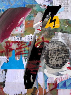
Canson ICC profile, Photoshop CC 2015.5, Madrid Wall Composite copyright George Schaub

In the color image, the Canon delivered a cleaner (somewhat brighter) yellow and a slightly more differentiated red.  Both printers yielded a rich D-Max (deep black) with nice tonal gradation from dark to light gray. Bright whites were clean with very subtle highlight values down from bright to soft white. Blues and cyans seem richer on the Epson print. These comparatives are based on side-by-side prints: taken alone each is very good and would be more than pleasing to the eye.

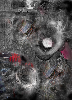
Canson ICC profile, Photoshop CC 2015.5, Composite 2 copyright George Schaub

I chose a composite graphic with both grayscale and subtle color touches to check how the Canon and Epson would handle the black and white values without using the monochrome checkoff option in their drivers. The dark tonal areas of the monochrome values in the image were reproduced with a rich and even startling depth; highlights maintained their starkness without loss of textural nuance. If anything, the SureColor P800 yielded richer reds and subtler blues, a result that was apparent in the full color image print as well.


I chose a monochrome image that displays a very wide gamut of values, from creamy and textural whites through a range of grays to deep black. I used the “black and white” checkoff in the Canon driver and Epson’s Advanced Black and White mode. Both prints showed a depth and tonal separation that was very pleasing, with the Epson printing out a tad darker overall. I would not hesitate to use this paper for any of my monochrome images.

Conclusions and Recommendations
Now that we have printers that can yield excellent results, printmakers owe it to themselves to work with inkjet papers that can bring out the most vivid and vital tonal values and hues of the image itself. Working with the ICC profiles and, with monochrome images and settings in the respective printer drivers, Canson’s Baryta Prestige showed itself to be an excellent partner to these two quality inkjet printers. New to the market as of fall, 2016, it can take its place among the thoroughbred class of fine art papers that has the weight, surface, optical density, wide color gamut and archival characteristics that will allow you to make prints that you will be proud to display.

Contact, size and pricing: www.canson-infinity.com/en